
Creating a standout web presence in today’s digital realm is no cakewalk. Typography emerges as a silent yet potent force in this endeavor. It’s not just about making text visually appealing; it’s about crafting an experience that resonates.
In this exploration, we tackle the pain points of web design, highlighting how typography addresses these challenges. We’ll delve into font basics, effective pairing, web-safe fonts, and the often-overlooked aspect of responsive typography.
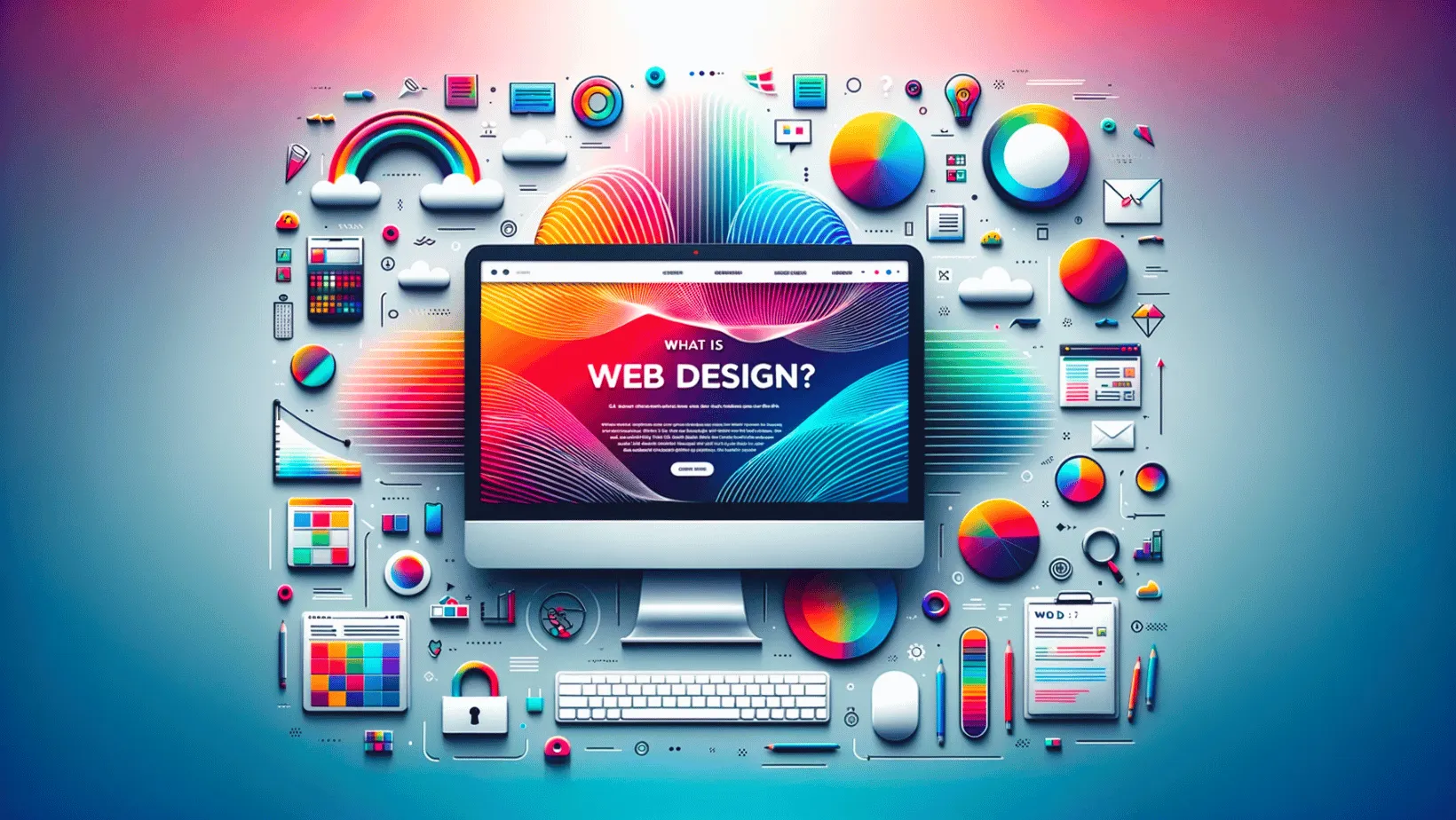
Let’s understand why fonts matter and how they can elevate your website design West Palm Beach. Welcome to Typography Triumph, where the right words in the right style redefine your digital impact.
The Font Basics
Typography, the art of arranging and designing text, may initially feel like navigating an intricate maze. Want to know how to choose the best fonts for websites? Let’s unravel the mysteries, starting with the fundamental elements that form the backbone of font choices.
Serif Vs. Sans-Serif
Serif fonts, characterized by decorative strokes at the end of characters, exude a sense of tradition and formality. On the flip side, sans-serif fonts, sleek and without those ornamental strokes, lean towards a more modern and clean aesthetic.
Font Styles
Within the realm of website fonts, we encounter regular, italic, and bold.
- Regular: The baseline style, commonly used for body text, strikes a balance between readability and simplicity.
- Italic: A slanted variation that adds a touch of emphasis or style, often used for quotes or to convey a distinct tone.
- Bold: Thicker and darker characters command attention, serving to highlight important information or create a strong visual impact.
Font Weight
Beyond styles, fonts come in various weights. Light fonts convey a delicate touch, while heavy or bold options make a bold statement. Balancing weight is crucial for achieving the desired visual hierarchy in your design.
Font Size and Line Spacing
Determining the ideal font size and line spacing is crucial for readability. Too small, and your message gets lost; too large, and it may overwhelm. Strike the right balance to ensure your audience engages effortlessly.
Typeface and Font Families
Typefaces encompass a range of fonts united by a consistent design. Within typefaces, font families offer variations, like different weights and styles, allowing for cohesive diversity in your design.
Choosing the Right Font
Now that we’ve covered the basics, let’s dive into the practical aspect of typography which is choosing good fonts for websites. It’s more than just visual appeal. It’s about creating a seamless experience for your audience. Here’s a straightforward guide to navigating the sea of webpage fonts.
1. Font Pairing Mastery:
In the world of typography, font pairing is about making intentional choices. Combine fonts with a balanced contrast to create a visually appealing design. The goal is a harmonious blend that doesn’t distract but enhances the overall aesthetic.
2. Prioritizing Readability and Aesthetics:
Balancing readability and aesthetics is key. Opt for fonts that not only look good but also ensure your audience can easily absorb the message. It’s about finding the middle ground where visual appeal meets clarity.
3. Consistency Across Platforms:
Consider the practicality of your font choices. Web-safe fonts guarantee a consistent look across devices and browsers. However, don’t shy away from exploring custom fonts for a unique touch. Strive for a balance that aligns with your brand identity while ensuring accessibility.
Responsive Typography
Responsive Typography is a crucial aspect of web design, addressing the need for adaptability across various devices. It goes beyond mere aesthetics ensuring that your message maintains its visual appeal and readability consistently, whether accessed on desktops or smartphones.
1. Adapting to Varied Screen Sizes:
Responsive Typography is the art of making text flexible. As users switch between devices with different screen sizes, fonts adjust accordingly, maintaining optimal readability. This adaptability is crucial in an era where browsing happens on everything from large monitors to compact mobile screens.
2. Fluid Font Sizing:
The key to responsive success lies in fluid font sizing. Gone are the days of one-size-fits-all. Fonts scale smoothly, guaranteeing a comfortable reading experience without sacrificing style or design integrity. Choosing the best website font sizing is a game-changer for keeping your audience engaged regardless of the device they choose.
3. Consistent User Experience:
The beauty of responsive typography goes beyond aesthetics. It ensures a consistent user experience, reinforcing your brand’s credibility. No more squinting or zooming in; your audience enjoys a seamless reading experience, fostering engagement and trust.
Elevate Your Design with Typography Triumph!
Embark on your journey armed with the insights gained. Experiment, refine, and let Typography Triumph be your guide to crafting web designs that captivate, engage, and stand out in the digital tapestry.
To further enhance your online presence, consider partnering with a web design company in West Palm Beach. Their expertise can amplify the impact of your meticulously crafted designs, ensuring your message reaches the right audience in the vast digital landscape.
Your next step? Dive in, master the art of typography, and reshape your online presence with the support of a seasoned digital marketing partner!